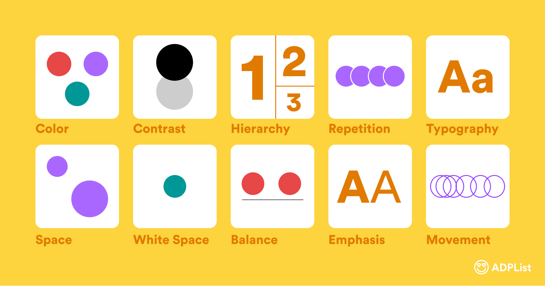
Graphic design is an essential aspect of many businesses and organizations, as it helps to visually communicate their message to the audience. From creating logos to designing brochures, graphic design is used in many ways to make a lasting impression. To create effective designs, it’s essential to understand the principles of graphic design. In this post, we’ll cover 10 essential principles that every graphic designer should know.

Image by @adplist
- Balance Balance is the distribution of elements in a design to create visual harmony. There are two types of balance: symmetrical and asymmetrical. Symmetrical balance is achieved when elements are mirrored on both sides of a design, while asymmetrical balance is achieved when elements are arranged in a way that creates equilibrium.
- Contrast Contrast is the difference between two or more elements in a design. It can be achieved through the use of color, size, shape, or texture. Contrast helps to create visual interest and draw attention to important elements in a design.
- Emphasis Emphasis is used to draw attention to a specific element in a design. This can be achieved through the use of color, size, contrast, or placement. Emphasis helps to create hierarchy and guide the viewer’s eye through the design.
- Repetition Repetition is the use of the same element multiple times in a design. This helps to create consistency and unity, and can be used to create patterns or visual interest.
- Alignment Alignment is the arrangement of elements in a design to create a cohesive whole. Proper alignment helps to create a sense of order and clarity in a design.
“Design is not just what it looks like and feels like. Design is how it works.” – Steve Jobs.”
- Proximity Proximity is the arrangement of elements in a design to create a visual relationship between them. This helps to create organization and hierarchy in a design.
- White space White space, also known as negative space, is the area between elements in a design. It helps to create balance, contrast, and visual interest. Proper use of white space can also improve readability and comprehension.
- Typography Typography is the art of arranging type to make written language legible, readable, and appealing when displayed. It involves selecting typefaces, point sizes, line lengths, line-spacing, and letter-spacing, and adjusting the space between pairs of letters.
- Color Color is one of the most important elements in a design, as it can evoke emotion and create mood. It’s important to use color effectively to create contrast, emphasis, and balance in a design.
- Unity Unity is the concept of creating a cohesive whole in a design. It involves using the principles of design to create a harmonious and visually pleasing composition.
In conclusion, understanding the principles of graphic design is essential for creating effective and visually appealing designs. By using these principles, you can create designs that are balanced, contrasted, and unified, and that effectively communicate your message to the audience.


